When we redesigned our newsletters, we came from far.
I arrived in the company to find very bad emailing practices. No responsive at all, no TEXT version, absolutely all best practices were missed by my predecessor.
Recently, I’ve been in charge of the redesign of all newsletters for many countries. Now, all our newsletters are responsive, has a TEXT version and some other best practices like physical address, two one-click-unsubscription links and many more…
But with several years of bad practices, how to tell our subscribers to open this new newsletter? If they were used to not open it, why would they now? And if they not, our redesign will be useless.
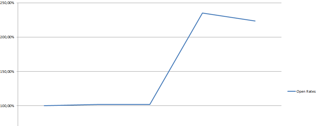
All is not perfect yet, but with two tips, help user to open your newsletter and increase your open rates.
1 – Preview Snippet
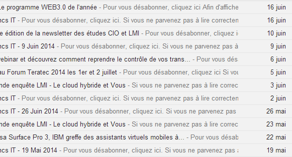
It’s not so much, and it’s so easy, that I can’t understand why companies does not take more care of this: the one or two lines of preview that many mail client offers. These two lines are what your reader see first when they receive your email:


In some case, like this one, the preview display to reader “click here to unsubscribe”! This is definitely not what we want readers do!
By adding this little snippet in the pre-header of your emails, you can fix this. Remember that this must be the first thing in the HTML body (after any CSS rules or HTML header)
<!--[if !mso]><!-->
      <p><font color="#F8F8F8"><?php echo( $firstItem->title ); ?></font></p><?php // <font> tag is a hack for outlook.com webapp 2010 ?>
<!--<![endif]-->
The [if !mso] is here to prevent the line to be display on MS Outlook. Of course, this won’t work for all Outlook version, and outlook.com web app, per example, doesn’t care much of that. So we have to hack it a little more by adding the “font color” with the same color as the background. In all mail client (gmail, outlook application, apple mail…) the line won’t event be shown. In outlook.com, the line will be transparent, resulting a “blank” line above the header.
Use jokes, customizing them for special day per example, be creative!
Here what it looks like:


2 – Custom Subject
The second tip is not a code tip, it’s more an editorial one. Using custom subject line will be more remarkable by your reader than always the same “Our super daily newsletter”.
Try to use the title of the most interesting story in your newsletter.
